Building a Castle: Part 2, Focal point images
Dealing with image scales, sizing and dimensions is one of the more difficult and infuriating aspects of managing content.
Content editors aren't always keen on knowing and uploading their images into the correct dimension. More over, designs often require multiple dimensions to show an image at.
It seems more and more that designs require effective use of image sizes so widths and heights match up without skewing the image.
Options
- Make user upload multiple copies of an image and require them to crop to the correct sizes. You can provide widgets and forms to make this less error prone but still annoying for user.
- Require the user to crop each scale that is used in your design for each image. plone.app.imagecropping does a nice job of this but it's quite a bit to ask of your content editors still.
- Automatically crop images with css and provide a focal point around which your cropping css cropping with occur.
Obviously, we choose option #3 here. This way is the easiest for content editors to manage.
How to use it
It's as simple as pointing and clicking on the area of the image you would like to focus on when you upload and edit the images on your site.
Take a look at the demo:
How it looks
It can look however you want it to in your content depending on your design but with it, you can do things like this without your content editors needing to crop any images.
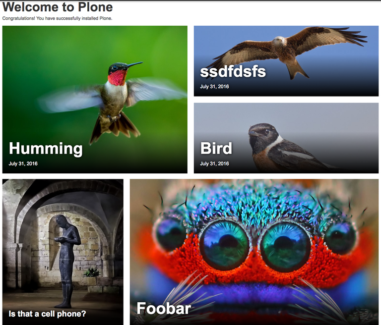
Notice how we can easily align all the heights and widths this way and show the important part of the image without requiring the content editor to crop a bunch of images.
How it works
It works by storing the focal point data you set on the image by clicking the area of the image that you want and then, on render, JavaScript takes over and applies the correct CSS onto the element so it positions itself correctly depending on the width and height defined in CSS.
The <img> tag needs to be wrapped in a div and the wrapper div needs to have a height defined for it in CSS in order for it to calculate the proper translation.
Here is some sample markup:
<div class="focuspoint" data-h="1365" data-w="2048" data-focus-x="-0.2596875" data-focus-y="-0.9946875">
  <img src="http://foobar.com/my-image.jpg/@@images/image/large">
</div>
Then, the JavaScript will apply CSS on the element to move it to the correct focal point location. Example:
<img src="http://foobar.com/my-image.jpg/@@images/image/large"
     class="max-width: 100% !important; top: -63.1818%; left: 0px;">
Bonus: progressive image loading
Since we moved some of the image sizing and processing into CSS and JavaScript, we can also do clever things with loading lower scale images by default and delay loading images that are not currently viewable on the page. This greatly improve overall bandwidth usage and mobile experience.